Miami is a melting pot of cultures, with residents claiming more than 20 different nationalities and speaking even more languages. But that pales in comparison to the vast influx of visitors from foreign countries served at its main airport. Miami International Airport (MIA) ranks third in the nation for international traffic, with 16 million total passengers annually.
In 2006, airport officials launched an ambitious project to construct a new terminal just for international arrivals and departures. One of the project's biggest challenges involved accommodating visitors speaking a wide variety of languages. Travelers needed signs to direct them from Point A to Point B with visual clues about where key airport functions such as gates, restrooms or baggage claim were located.
 "Most people in the international terminal aren't professional travelers," says Todd Lambert, aviation market manager for Daktronics, one of five companies hired to create and install signs. "For them, traveling can be a nerve-wracking endeavor of trying to locate basic needs in a foreign country."
A New Plan
To help travelers, MIA hired Jacobs Engineering Group to create a wayfinding master plan, from which sign standards and guidelines could be created. Over the years, the airport had developed many layers of wayfinding systems, signs and graphics. The new master plan was designed to ensure uniformity when it came to information format and sign placement throughout the entire facility complex, including roadways and parking garages.
The plan was developed to be implemented over time as part of construction and renovation projects, and to provide guidance for future developments, says Kyle Reath, a principal with Jacob's advance planning group and managing director of environmental graphic design. Because airport projects often take years to complete, items like wayfinding plans offer a common thread throughout the facility, even though individual terminals may have a different look or feel.
 |
"Whenever a terminal is constructed or remodeled, the architects and designers often want to leave their own mark by creating a facility that is unique in appearance. These physical changes not only alter the way an airport functions, but can be contextually disorienting when passengers transition through the facility. The signage system becomes the common thread or the brand that pulls everything together," says Reath. "Architectural designers want the freedom to design, and do so, within certain parameters, to create unique and functional spaces. A thought-out, well-written wayfinding plan and sign guidelines set standards that provide consistency from one project to the next while allowing airports flexibility in other areas, such as building design."
 |
Having such a standard ensures that over time, even though each terminal may look different, the signage provides the level of comfort and familiarity from one building to the next that is important to travelers, he adds. Such a standard means that airports are free to develop their own brand. More importantly, it means that a brand can be effectively applied through seamless integration over several years as budget money becomes available or new projects are launched.
Joe Labozan, president of Labozan Associates, helped write Miami International's wayfinding plan when he worked at Carter & Burgess. "Our goal in developing the plan was to ensure that travelers in the South Terminal enjoyed the same experience as those in the North Terminal," says Labozan. "We sought to bring logic and order to the way people navigate."
In creating the plan, Labozan tried to connect two pieces of a giant puzzle. The first was to create a standard vernacular, or vocabulary, for how required information is presented to users. For example, will the airport offer "toilets," "bathrooms," or "restrooms?" Will travelers walk through the "concourse," "terminal," or "gate?" Do they pick up suitcases in "luggage claim" or "baggage claim?"
The plan created a nomenclature specific to the Miami airport based on local language preferences, with a nod toward international travelers as well, notes Labozan.
Airports with high volumes of international travelers are often tempted to use multiple languages, but that's not always an effective policy, says Reath. Sign space is at a premium and designers don't want to clutter or dilute the message with too many signs and not enough "white space." Choosing which languages to use also poses considerable challenges.
 |
According to Reath, English is the international language for aviation. But, with many people speaking Spanish as well, especially in an airport like Miami's that serves travelers from Central and South America, the natural solution was to use English as the primary language with Spanish translations in smaller type. The effective use of symbols, says Reath, is a solution for the many other languages spoken every day.
 Although there currently are no international symbol standards, there are certain icons that people understand whether they are traveling in Miami, Toronto or Frankfurt. For example, symbols of men and women usually indicate the presence of restrooms. A suitcase directs people to baggage claim. A car with a dollar sign shows where people can board taxis.
The second piece of the puzzle/plan established a hierarchy, so the most important destinations would receive the highest priority in signing. For travelers checking in and catching flights, signs that direct passengers to ticket counters, through security and then to the proper gate locations are top priorities. However, they may need to visit restrooms, grab a sandwich and buy a newspaper along the way, so those signs had to be factored into the journey as well.
Although traffic was being funneled along a specific path, travelers – especially those from foreign countries – are comforted when they see signs that reassure them they are headed in the right direction. One of the keys to that reassurance is keeping the message wording, size, shape and appearance the same.
"The Miami airport had standards they didn't want to abandon, such as using Helvetica typefaces and black and white lettering," states Labozan. "Those standards needed to remain consistent whether someone was on the road leading to the airport, in the parking lot or walking through the facility."
|
Facts & Figures Project: Wayfinding Master Plan & Signage Overhaul Location: Miami International Airport Wayfinding Master Plan & Sign Guidelines: Jacobs Engineering Group (formerly Carter & Burgess, Inc.) Dynamic Displays: Daktronics Other Key Participants: Acolite Claude United Sign Company, Architectural Graphics, Baron Sign Manufacturing and Broadway National Sign & Lighting Major Objective: Improve passenger orientation and movement via a comprehensive new sign program Major Challenge: Accommodating high volume of international passengers and airport visitors |
Set-Up Considerations
Working together, the team then evaluated what the signs should look like and where they should be installed.
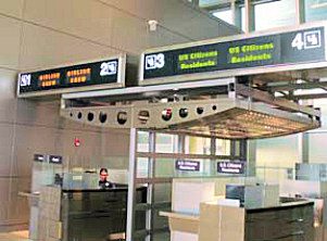
Airlines' names and their full-color logos are used on signs that are easily visible along the drop-off curb. This helps guide travelers to the right entrances and ticket counters. "It was the brand they recognized more than the words themselves," explains Lambert.
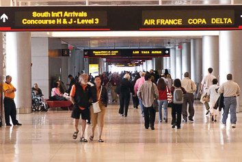
Once inside the door, large monochrome LED signs direct them to customs, baggage claim, restaurants and the airport's various terminals.
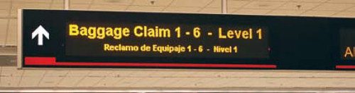
The process was reversed to aid international travelers landing at the airport. Once passengers exit the aircraft, they are directed into specific lines for customs. Once through that process, they are directed to baggage claim and finally to taxis, rental cars or curbside pickup locations. While the primary wayfinding system uses English and Spanish, baggage claim signs directing travelers to specific carousels are also printed in German.
A color scheme was established to help distinguish and identify various areas of the terminal. For example, blue is used in the North Terminal, yellow dominates the Central Terminal and red is featured in the South Terminal. Colors help travelers realize they are entering or leaving a specific area and help reduce the possibility of getting lost. The same color schemes were incorporated into the graphic portion of the directional signs as well, notes Richard Garcia, chief of airport signage at Miami International.
During the 18-month construction of the terminal, Daktronics and other sign companies worked with architects and planners to understand what the new building would look like and what airport officials hoped to accomplish with it.
The staff evaluated where the mass of airport visitors would most likely be throughout the day and placed wayfinding signs at key junctions. Architects factored in normal human behavior as they created specific paths to funnel passengers along. They also tried to anticipate the information visitors would need at various intersections or midpoints of the terminal.
Miami International's large, open areas provided Daktronics with placement flexibility because signs blend easily with the building's design. The same signs placed in other airports could look intrusive or clumsy because of lower ceiling height or other architectural elements, notes Lambert. But in Miami, the signs form a pleasing, modern graphic element.
The airport, in fact, plans to extend the signage plan from the international terminal into other areas like parking structures and roadway signs. The new signs will be phased into the original terminal building and newly opened concourses by 2011.
Many of the airport's existing illuminated signs will be preserved and retrofitted with new faces that conform to new graphics standards – saving money and promoting sustainability at the same time, notes Garcia.
Improving Traveler Satisfaction
According to Reath, signs are often one of the most important elements of a successfully functioning airport, but they've historically been an afterthought or low-priority budget item. "Airports in the past may have tried to save money on sign programs or simply added elements over time in reaction to evolving conditions and passenger complaints," he explains. "Today, directors, planners and facilities managers realize how important a good wayfinding system is to the public as well as the value it adds.
"It's not about the quantity of signs, it's about having the right information in the right place and defining pathways in an effective manner," he adds.
In the past, some airports adopted a philosophy of 'here's our building, now stick your signs in it,' Reath explains. Today, sign system planners and designers work closely with architects to integrate signs into the building's design. Architects now carve out space for critical sign elements so they all blend together.
"All of us know what it is like to have less than one hour to get from one terminal to another," notes Lambert. "That experience is even more challenging when travelers are unfamiliar with the country and the prevailing languages spoken at the airport."
The new universal signage at Miami International Airport presents a clear and consistent approach to wayfinding, says Garcia. "By reducing the amount of signs and displaying common terminology at key locations, passengers are assisted to areas of the terminal and the services they seek," he explains.
Garcia credits the new wayfinding plan and associated changes to airports signage for increasing passenger flow and overall customer satisfaction. He cites the J.D. Power and Associates 2008 North American Airport Satisfaction Study that ranks Miami International the sixth most improved airport. The study included signage and directions inside the terminal as one of the key criteria in determining traveler satisfaction, he explains.
It seems the airport is making strides to contradict the classic 1970 song "Signs," by Five Man Electric Band. The song expresses many of the frustrations international travelers feel: "Signs, signs, everywhere a sign; blockin' out the scenery, breakin' my mind. Do this, don't do that. Can't you read the signs?"
At Miami International, signs are intentionally designed, and placed, to blend with surrounding architecture, alleviate frustration and improve the overall travel experience.