San José Mineta International Airport Re-Introduces Itself with new Brand Identity
Airport’s public profile reimagined with new brand name, logo, colors, and tagline
|

San José Calif. – (January 23, 2023): Today, San José Mineta International Airport (SJC) announced its official changeover to a new brand identity. The comprehensive changes come after an extensive process by SJC to strengthen its position as a leading Bay Area gateway for customers locally and around the world. The new branding initiative means an overhaul of SJC’s public-facing identity, including a new brand name, logo, colors, tagline, and marketing materials. Today’s switchover begins the process of incorporating the slate of new brand elements, which will occur over the next several months.
"We are thrilled to re-introduce Silicon Valley’s airport to the world with these new brand elements," said John Aitken, Director of Aviation at SJC. "The process of examining and redeveloping our brand identity was crucial in helping us develop a deeper understanding of our community and what we needed to do to ensure we provide the best possible experience to our passengers and visitors."
WHAT'S IN A NAME?
The new brand name, San José Mineta International Airport, was selected to lead with location, helping travelers find SJC and strengthen the geographical association with San José. It also moves “Mineta” to the heart (center) of the name, and uses fewer words, which simplifies the visual identity and reflects the SJC’s brand promise of a streamlined airport experience. The name change only applies to the Airport’s public brand. An official name change would require action by City elected officials.
In addition to the new brand name, the new brand identity package includes a new logo and other visual elements that will be reflected across SJC’s signage, bus wraps, advertising, and communications materials for the Airport.
PROCESS AND RESEARCH
As the aviation industry addressed catastrophic passenger declines, SJC – which is self-supported and not funded by City tax dollars – used the opportunity to boost traffic by addressing lingering challenges with brand awareness and marketing visibility. The Airport's rebranding effort is a result of an extensive strategic research and brand development process conducted by SJC and marketing consultant, GALE Partners. Multiple market research studies identified brand elements that resonate with the local community and travelers around the world. The research indicated that travelers did not widely associate the Airport’s previous branding with San José or the Bay Area.
The brand analysis and identity redevelopment efforts included extensive qualitative and quantitative market research, which emphasized equity. Survey and research efforts included more than 2,100 surveys of individual Bay Area travelers, as well as one-on-one interviews with key stakeholders, such as Airport and City leadership staff, Silicon Valley Leadership Group, and Silicon Valley Business Travel Association. The research process also shared the logo and creative campaign elements with fluent speakers of Spanish, Chinese and Vietnamese.
NEW BRAND ELEMENTS
The new design elements incorporate updated colors and graphics and are designed to provide consistency, accessibility, and familiarity across all customer touchpoints.
New Brand Name: San José Mineta International Airport
New Tagline: Fly Simple.
New Logo: The new logo features a modern graphic identity that reflects the vibrancy and energy of Silicon Valley while providing simple and intuitive design elements. The new logo, presented vertically and horizontally, depicts the concept of “forward motion.” It is a simplified combination of symbols commonly found while traveling through an airport -- an overhead view of an airplane, its wings, and airfield directional symbols:

New Colors: The new brand's colors were inspired by San Jose’s culture and sense of place – including the City flag and local climate – warmth, sun, poppies, and ocean. The new logo color palette reflects the sky. MIDNIGHT is the primary brand color, representing professionalism and the promise of innovation. Featured colors include Dawn, Dusk, Sky, and Cloud.
For more information and resources, visit: www.flysanjose.com/newlook.
2022 Charlotte Douglas International Airport Report of Achievement
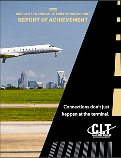 Giving back to the community is central to what Charlotte Douglas International Airport and its operator, the City of Charlotte Aviation Department, is about, and last year was no different.
Throughout 2022, while recovering from the COVID-19 pandemic, we continued our efforts to have a positive impact on the Charlotte community. Of particular note, we spent the year sharing stories of how Connections Don't Just Happen at the Terminal - from creating homeownership and employment opportunities to supporting economic growth through small-business development and offering outreach programs to help residents understand the Airport better.
This whitepaper highlights the construction projects, initiatives, programs and events that validate Charlotte Douglas as a premier airport.
Download the whitepaper: 2022 Charlotte Douglas International Airport Report of Achievement.
Featured Video
Featured Video
Digital Issue:
Connect


Publisher's Blog

# # #
Industry Insider

Project Nominations
Know of a project that should be covered in a future issue of Airport Improvement?
Artscapes
")
# # #
# # #
# # #
Airport Industry Headlines
- KC-46 to Appear at Air & Water Show As 128th Air Refueling Wing Works to Secure New Aircraft
- Rapid City Regional Airport Appoints Brian Bishop as New Deputy Director
- SEA Moves to All Reusable or Compostable Food Service Materials
- FAA Ensures D-Fend Solutions' EnforceAir2 Safe with Airport Operations, Navigation, Air Traffic Services, and the Efficient Operation of the NAS
- Colorado Springs Airport Sees Surge in Traffic for June
# # #
Airside Projects
- New Apron Lighting Resolves Glaring Issues at Dallas Love Field
- Florida’s Statewide Markings Program Evolves
- Lincoln Airport Takes Creative Route to Adding New Leisure Service
- New Taxiway at Myrtle Beach Int’l Improves Airfield Safety, Frees Space for Terminal Expansion
- Tampa Int’l Plots New Course to Enhance Airfield Safety
Baggage Projects
- Alaska Airlines Installs Self-Service Bag Tag Stations
- Rapidly Growing Volume of Oversized Baggage Prompts System Redesign at Salt Lake City Int’l
- Columbia Metropolitan Upgrades Baggage System and Ticketing Lobby
- Long Beach Airport Adds Permanent Checked Baggage Inspection System and Improves Ticketing Building
- New Concourse at Phoenix Sky Harbor Features Advanced Baggage Handling System
# # #
Cargo Projects
- Spokane Int’l Builds Rail-Truck Facility on Surplus Land
- Halifax Stanfield Builds Cargo Park With Cold Chain Capabilities
- Extensive Cargo Growth at Cincinnati Int’l Boosts Revenues, Diversifies Business Base
- FedEx Expands at Ontario Int’l to Support Growing E-Commerce Demand
- Winnipeg Int’l Adds Multiuse Facility to Enhance Cargo Operations
Concessions/Retail Projects
- Wilkes-Barre/Scranton Int’l Builds New Quick-Turn Facility for Rental Car Operations
- LaGuardia’s New Chase Sapphire Lounge is a Rare Gem
- Can-Do Concession at San Francisco Int’l Comes Through for Customers in a Pinch
- Digital Storefronts Drum Up Support for Airports
- New Beauty Concept Store at JFK Int’l Caters to Style-Conscious Passengers
# # #
Emergency Operations Projects
- New ARFF Facility Boosts Efficiency, Paves Way for New Terminal at Monterey Regional
- Decatur Airport Builds New Facility for Firefighting and Maintenance Teams
- Naples Airport Recovers After Hurricane Ian’s Saltwater Storm Surge
- Sacramento Int’l Builds Bigger, Better Fire and Rescue Station
- Hybrid Fire Station at San José Int’l Provides Emergency Services for Airport and Surrounding Area
Environment/Sustainability Projects
- Toronto City Airport Leads the Move to Fluorine-Free Firefighting Foam
- New Noise Technology System at Minneapolis-St. Paul Int’l Earns Patent
- Martha’s Vineyard Airport Tests Underground Filtration for PFAS Contamination
- Santa Maria Airport Takes Common Sense Approach to PFAS Testing
- Philadelphia Int’l Follows Envision Program for Major Taxiway Rehab
# # #
Fuel Operations Projects
General Aviation Projects
Ground Support Projects
- Montgomery Regional Leaps Into the Future With Electric Aircraft Chargers
- Exterior Jet Bridge Coating Saves Energy, Increases Passenger Comfort at Harry Reid Int’l
- O’Hare Moves Aircraft Deicing From Gates to High-Tech Centralized Facility
- Ground Power Upgrades in the Works at Newark Int’l
- Long Beach Airport & Airline Partners Phase Out Fossil Fuels for Ground Support Equipment
# # #
Hangar Projects
IT/Communications Projects
- Hawaii Provides State-Owned Airports with Online Platform for Environmental Systems Management
- Website Platform Helps Airports Attract More Customers
- Virtual Ramp System at Kansas City Int’l Provides 360-Degree View of Airfield
- Interactive Web Page Offers Planning Tools for Memphis Int’l Travelers
- Seattle-Tacoma Int’l Invests in Data Management Upgrade
Landside Development Projects
Operations Projects
- Safety Management Systems at Airports
- Sarasota Int’l Gets Creative Introducing Local Students to Aviation
- Safety Management Systems: Lessons from the Airline Sector
- Historic Wildfires Prompt Kelowna Int’l to Move Commercial Flights From Day to Night
- Terminal Expansion at Kansas City Int’l Prompts New Snow Removal Strategy and Equipment
Parking Projects
- Boise Airport Expands Parking for Growing Local Population
- Moving Walkways Replace Decades-Old Monorail at Tampa Int’l
- Sarasota-Bradenton Int’l Adds New Cellphone Lot With Improved Amenities
- Flagstaff Pulliam Implements Paid Parking Program
- New 7-Level Garage Increases Parking Capacity and Convenience for Customers
Passenger Transport Projects
Runway/Ramp Projects
- New Engine-Testing Facility Enhances Safety, Functionality and Efficiency at Michigan Airport
- Punta Gorda Closes Runway, Powers Through Rebuild Project
- Vancouver Int’l Turns Untimely Winter Storms Into Opportunity for Improvement
- Airports Apply Heavy Surface Treatment to Increase Service Life of Asphalt Runways
- Round-the-Clock Work Helps Cheyenne Regional Finish Paving Project On Time
Security Projects
- Daytona Beach Int’l Implements State-of-the-Art Security Measures
- Dallas Fort Worth Int’l Bolsters Employee Security Screening Program
- Denver Int’l Completes State-of-the-Art West Security Checkpoint
- Harry Reid Int’l Tests Self-Service Checkpoint
- Automated Exit Safeguards and Welcomes Passengers Arriving at Oakland Int’l
Terminal Projects
- Ticketing Hall Expansion Adds Much-Needed Space at Reno-Tahoe Int’l
- Atlanta Int’l Combines Modular and Traditional Build Methods for Concourse D Expansion
- New Satellite Concourse Provides Efficient Gate Expansion at Nashville Int’l
- Phoenix-Mesa Gateway Completes Five-Gate Addition
- New Outdoor Deck Relieves Passenger Congestion at Charlottetown Airport
# # #
# # #